

AGRA Rebrand: Visual Identity and Branding for a Professional Membership Organisation
Rebrand for a genealogy organisation
How I helped a genealogy body that unified 100+ members under one brand after a flexible identity system
The Problem
AGRA, the Association of Genealogists and Researchers in Archives, is the professional body promoting high standards in genealogy and historical research across England and Wales. Their whole purpose is credibility: they're the mark of professionalism in their field.
But their brand wasn't carrying that weight. They came to me for a complete overhaul, and to address the problems they were facing:
- The brand didn't reflect the standard they set. For an organisation whose entire role is professional excellence, the visual identity needed to signal that at a glance, and it wasn't yet.
- It had to work everywhere, for everyone. From leaflets to podcast covers to individual member badges, the identity needed to flex across dozens of applications without falling apart.
- Every decision had to win over a committee. AGRA is run by its members, so nothing could be signed off by one person. The brand had to satisfy a wide range of opinions and still feel cohesive.
What AGRA needed was an identity that looked as professional as the standards they uphold, and that every member could use confidently and correctly.
The Solution
The groundwork was already partly done, AGRA had completed customer research and begun their marketing strategy before reaching out, so my job was to turn their thinking into a working identity. I built it around their own core idea: connections.
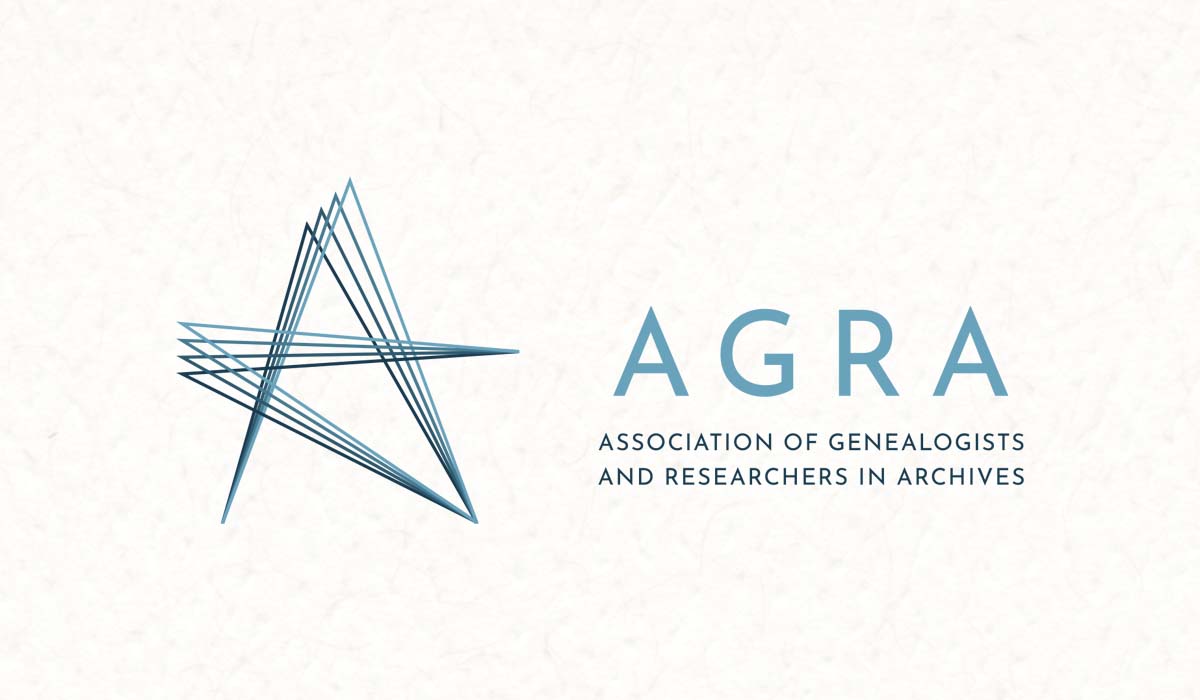
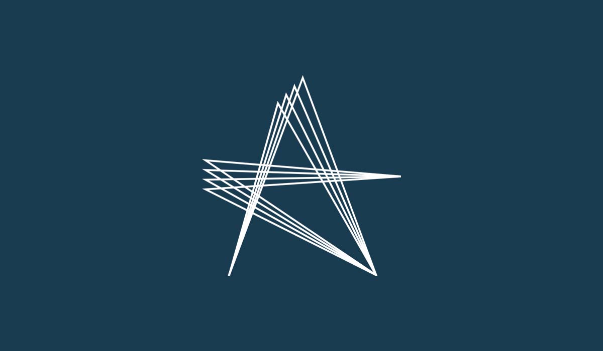
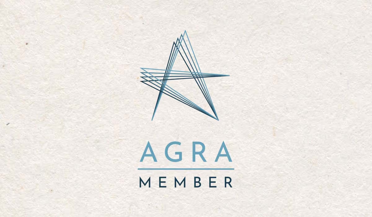
- A logo rooted in "connections" and excellence: so the mark carried real meaning. Built from the "A" of AGRA, it captures both the sense of connection at the heart of their work and the professionalism they stand for.
- An extendable line-graphic system: so the identity could stretch across everything. The logo's lines flex out into supporting graphics that hold the brand together across every application.
- A clear, collaborative sign-off process: so a whole committee could get behind it. I presented and talked through each decision on our calls, bringing a wide range of views along rather than working in isolation.
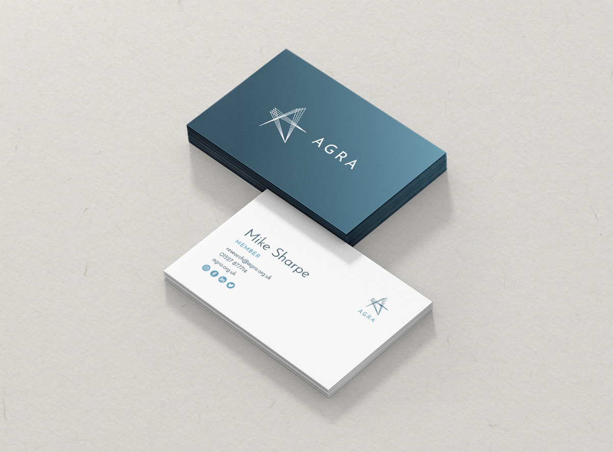
- Individual member logo versions: so every member could represent AGRA properly. Each got their own version of the mark, built to keep the brand consistent no matter who was using it.
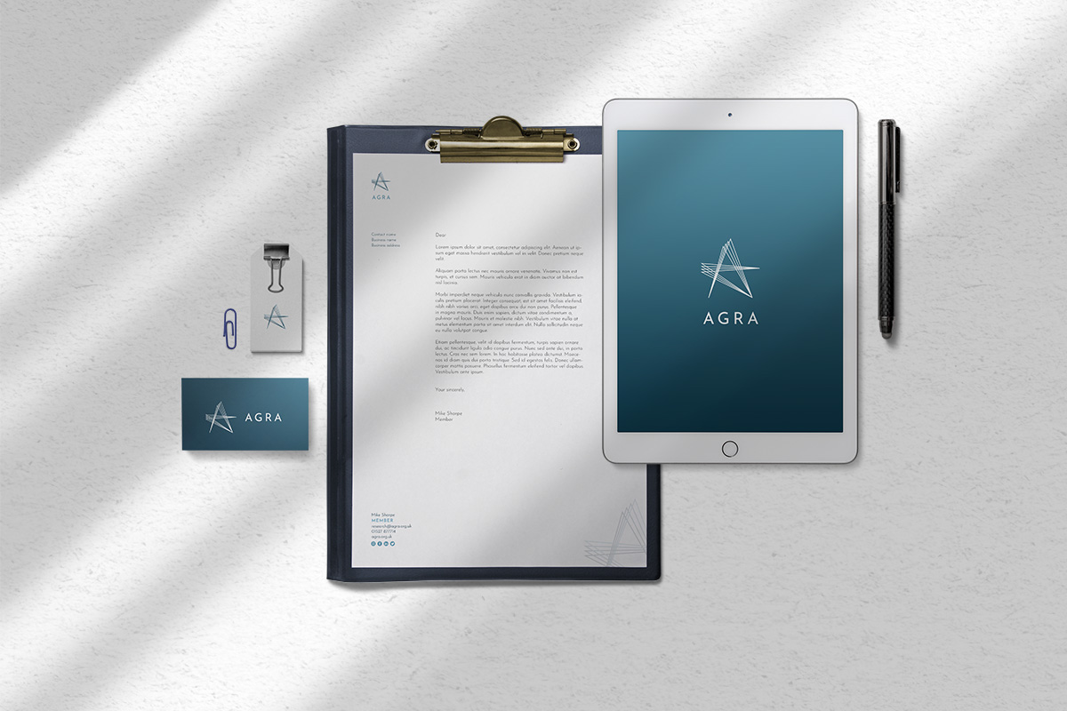
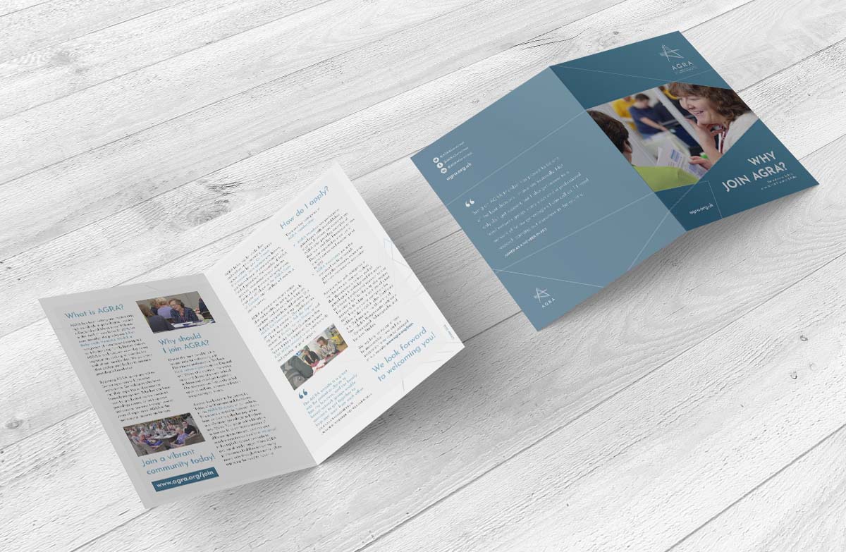
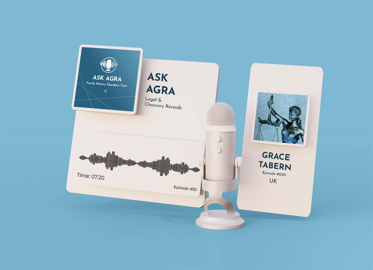
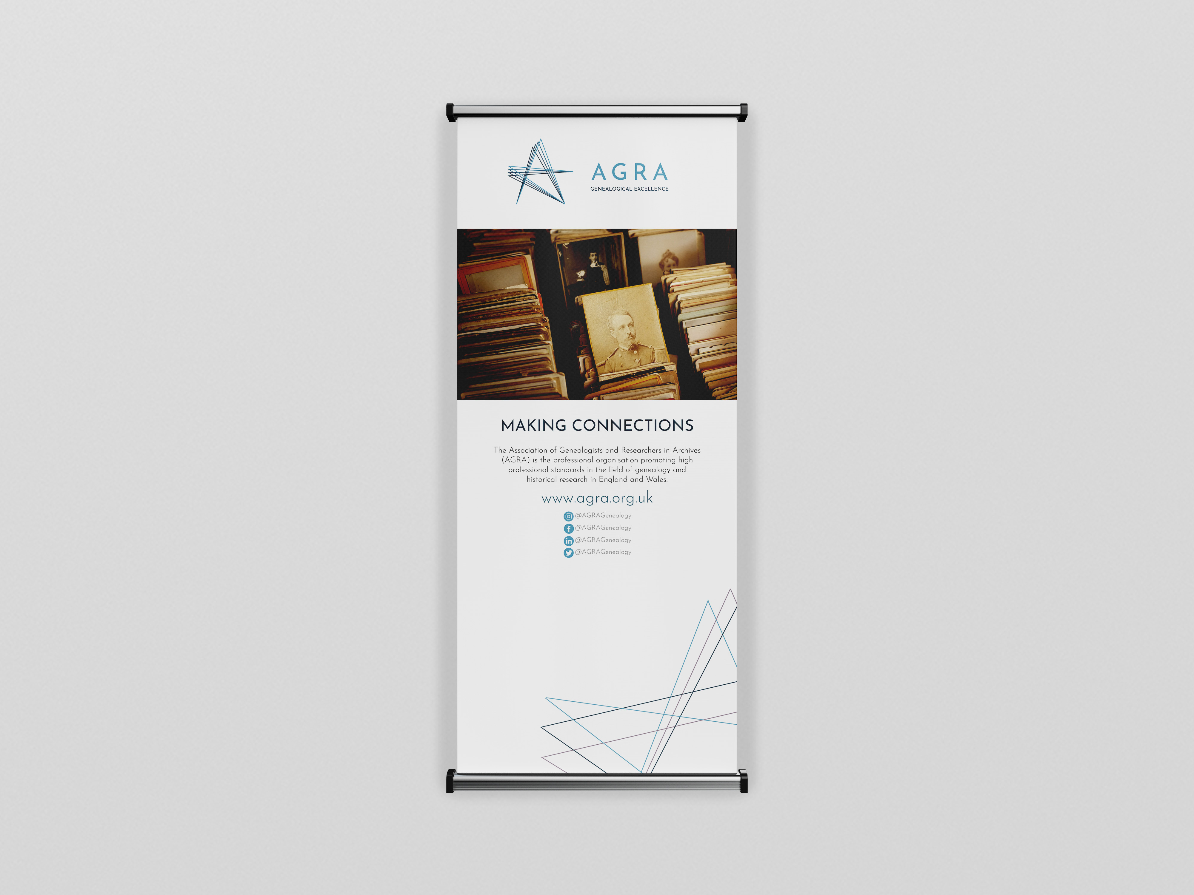
- A full suite of assets and brand guidelines: so the identity worked in the real world. Members' leaflets, newsletter header, podcast covers, badges, pop-up banner, social assets, and guidelines to keep it all consistent.
The Outcome
AGRA now has an identity that looks the part, and holds together everywhere.
- A distinctive, recognisable visual identity that reflects their professional standing
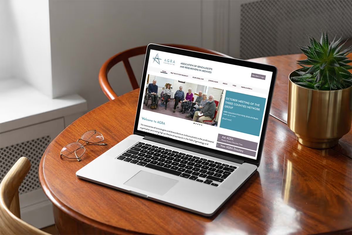
- A flexible system that works across every touchpoint, print and digital
- Individual logo versions so members can represent the organisation consistently
- A full suite of branded assets, from podcast covers to badges
- Clear brand guidelines so everyone knows how to use it correctly
- Consistency across the whole organisation, from the centre out to every member


My Reflections
This was an incredibly interesting project, partly because AGRA arrived with so much already in place: research done, strategy underway, a clear core idea in "connections". My role was to translate all of that into an identity that worked as hard as they do.
The real craft here was in the detail: making an identity that could flex across every application, give every member their own version to use, and still feel like one coherent brand. For an organisation whose whole reputation rests on professional standards, that consistency is everything.
Let's elevate your brand today
Get in touch
