
Why a New Logo Wasn't Enough: Charity Rebrand for Funding For All
Rebrand case study for Funding For All
If you're leading a UK charity, social enterprise, nonprofit or values-driven organisation and wondering whether your brand is holding you back, this case study is for you. Here's what a full charity rebrand actually involves, what the process looks like from the inside and what it can do for a purpose-led organisation ready for its next stage of growth.
"For the people who show up, even when it's hard. For the ones trying to do good, without always knowing how. We believe in the power of small."
— excerpt from Funding For All's brand manifesto
_c.jpg)
The Client
Funding For All is a Kent-based charity supporting VCSEFs — voluntary, community, social enterprise organisations and faith groups — with funding and fundraising guidance. For nearly two decades they've been quietly doing vital work, helping small organisations access the resources they need to make a difference.
But quietly doing vital work was part of the problem.
One of the most common questions I hear from charity and nonprofit leaders is: do we actually need a rebrand, or just a refresh? The answer almost always depends on whether your brand still reflects who you'veb ecome and whether it's helping or hindering your ability to grow.
For Funding For All, the answer was clear but only once we started digging.
The Brief
The initial request seemed straightforward - they needed a new logo.
Their original identity had been inherited when the organisation was founded, however, nearly 20 years later it no longer reflected who they had become. It caused confusion, felt outdated and was holding them back from presenting themselves with the credibility and confidence their work deserved.
With a significant anniversary on the horizon and ambitious plans for the future, they wanted an identity that felt fresh, modern and built to carry them forward for the next 20 years.
"We'd inherited a logo that caused confusion."
The Challenge
Because this identity had been with Funding For All from the very beginning, there was real sensitivity around changing it. Would a new brand still carry the ethos of what they stood for? Would it alienate the community they'd spent two decades building relationships with? Was the change even necessary?
These are questions I come across regularly with charity and nonprofit rebrands. And they're the right questions to ask. And these questions reveal that this wasn't just a design problem, it was an identity problem, a confidence problem and a clarity problem.
The logo was a symptom but the real challenge was deeper.
_c.jpg)
_c.avif)
_c.jpg)
Where We Started: The Discovery Process
Every charity rebrand I work on begins the same way. Not with sketches or mood boards, but with listening.
Before a single design decision is made I need to fully understand the organisation from the inside out. What are we really trying to solve here? What's the history? What's working and what isn't? Who are you trying to reach and why do they choose you over anyone else?
For Funding For All this meant a thorough kick off session with key stakeholder interviews. I spoke to people across the organisation. staff, trustees, people who had been there from the beginning, to understand not just what Funding For All does, but what it means to the people it helps and the people who deliver it.
This is where the real brand lives. Not in a brief or in a logo. But in the stories, the values and the lived experience of the people inside the organisation.
Alongside the stakeholder interviews I carried a thorough brand audit, analysing every existing touchpoint to understand what was working, what was inconsistent and what was actively undermining their credibility. I researched the sector, analysed competitors and mapped the landscape to understand where Funding For All sat and where it had the opportunity to stand out.
What came out was something far richer than a logo brief. It was the beginning of a complete brand foundation.
Building the Brand Foundation
This is the part of the charity rebranding process that most clients don't expect and that makes the biggest difference.
Before we touched visuals I worked with Funding For All to build the strategic foundation that would underpin everything. Their positioning, values, brand personality and the language that would capture who they truly are and what they stand for.
Getting the positioning right meant going back to the insights from the discovery process, testing different angles, challenging assumptions and pushing beyond the obvious to find something that felt genuinely true and genuinely distinctive.
For Funding For All the positioning centred on something that kept coming up in the stakeholder interviews - the belief that small organisations doing good work deserve the same support, credibility and resources as larger ones. That the work happening quietly in communities across Kent mattered and the people doing it deserved to be seen and supported.
"We believe in the power of small."
That became the thread running through everything.
The Values
This wasn't a generic list of words that could belong to anyone but a set of values that were specific, meaningful and true to Funding For All. Values that their team could get behind and that their community would recognise immediately.
The Brand Voice
How does Funding For All sound? Warm, human, encouraging and deeply knowledgeable. Not corporate or distant. They are accessible and expert in equal measure.
The Manifesto
Writing Funding For All's brand manifesto was a tricky piece but was one that captured the heart and soul of who they are.
"We believe change doesn’t start in boardrooms. It starts in community halls, kitchens, WhatsApp groups, and late-night planning calls by people who care enough to act."
Kerry told me later that the manifesto still gives them goosebumps every time they read it. That it says everything they'd been trying to say for 20 years but had never quite managed to put into words. They now use it everywhere, in mentor handbooks, on their website, even in interviews and funding applications.
That's what a brand foundation does - it gives an organisation the language to express its purpose with confidence and conviction.
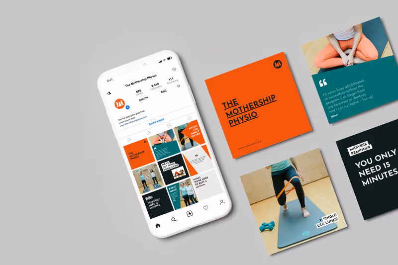
The Visual Identity
With the brand foundation in place the visual identity process had something solid to build from. Every design decision, the logo, the colour palette, the typography, the flexible brand identity system, was rooted in the strategic work we'd done together.
The result was a modern, distinctive visual identity that felt immediately like Funding For All. Not a generic charity brand or corporate rebrand, but something that captured the warmth, the humanity and the quiet determination of their organisation.
The identity was designed to be flexible so that it can work consistently across digital and print, adaptable for different audiences and contexts, and built to serve them for the next 20 years.
The final deliverable included a complete set of brand guidelines, which gave the whole team the tools and confidence to use their new brand consistently and independently from day one. For a nonprofit organisation without a dedicated design team, this is not a nice-to-have but essential.
_c.avif)
_c.avif)
The Result
The transformation went far beyond a new logo.
Funding For All came away with a clearer sense of who they areand how to communicate that, both visually but verbally. Their team is now aligned around a shared brand foundation that gives everyone the language and confidence to represent the organisation consistently. Their materials look cohesive and professional. Their identity reflects their current impact rather than their starting point.
Key outcomes:
- A clearer, more confident sense of organisational identity
- Shared brand language the whole team can use consistently
- A flexible visual identity system built for the next 20 years
- Renewed energy, momentum and pride in the work they do
- A brand that attracts the right funders, partners and beneficiaries
In Kerry's Own Words
"Working with Vardeep has been transformative for us. We thought we were getting help with a logo, what we actually got was a complete reimaging of how we see and communicate who we are. She captured the heart and soul of our organisation in a way we hadn't managed to express. The manifesto she wrote still gives us goosebumps every time we read it. It speaks directly to the heart of our work. We now use it everywhere — in our mentor handbooks, on our website, even in interviews — because it helps people instantly understand what we're about. The new identity feels exactly like us: modern, universal, and full of meaning. For years, our old logo held us back — it was confusing, outdated. Now, we feel proud, confident, and energised. Beyond the visuals, the whole process was sensitive and deeply collaborative. Vardeep handled the process with empathy, patience, and real skill. She gave us a brand we love and the language to express it. It's lifted a weight from our shoulders, given us fresh momentum, and reignited our pride in what we do, knowing we are expertly positioned for the next chapters of our charity's work and all the people we support."
— Kerry Donati, Funding For All
Frequently Asked Questions About Charity Rebranding
What does a charity rebrand involve?
A full charity rebrand goes far beyond a new logo. It includes a discovery process, stakeholder interviews, brand strategy, positioning,messaging, visual identity design and brand guidelines. The goal is to build a brand that truly reflects who the organisation has become and gives the whole team the tools to communicate that consistently.
How do I know if my charity needs a rebrand?
If your brand no longer reflects who you've become, feels inconsistent or outdated, or is holding you back from the funding, partnerships and reach you need, then it's time to consider a rebrand. Other signs include: your team lacks confidence using your brand materials, you feel invisible in your sector, or prospective funders and partners don't immediately understand what you do.
Does a nonprofit or social enterprise need brand strategy?
Yes, perhaps more than any other type of organisation. Purpose-led organisations like charities, nonprofits, social enterprises and Bcorps need a brand that clearly communicates their mission and impact. Without a solid brand strategy, even the most beautiful visual identity won't do the job it needs to do.
How long does a charity rebrand take?
Every project is different. A full brand rebirth, from discovery through to final brand guidelines, typically takes between 8 and 12 weeks, depending on the size and complexity of the organisation and the scope of the work involved.
Ready to build a brand that reflects your impact?
Then get in touch, I'd love to help you!
Working with Vardeep has been transformative for us. We thought we were getting help with a logo, what we actually got was a complete reimaging of how we see and communicate who we are.

A Note From Me
Clients often come to me asking for a logo. And I understand why as it feels like the most visible and tangible thing to fix.
But in almost every charity rebrand or nonprofit rebranding project I work on, the logo is just the surface. Underneath it there's usually a deeper challenge around a lack of clarity about who they are, a disconnect between how they see themselves and how the world sees them, or simply a brand that was built for who they were rather than who they've become.
My job isn't just to make things look better. It's to dig beneath the surface, find the heart of what an organisation stands for, and build something that truly reflects it with the depth, the meaning and the foundation to carry them forward.
That's what happened with Funding For All. And it's what I bring to every project I work on.
"If your brand no longer reflects the organisation you've become, I'd love to talk."
— Vardeep Edwards, The Branding Fox
Explore more case studies


Let's elevate your brand today
Get in touch
