
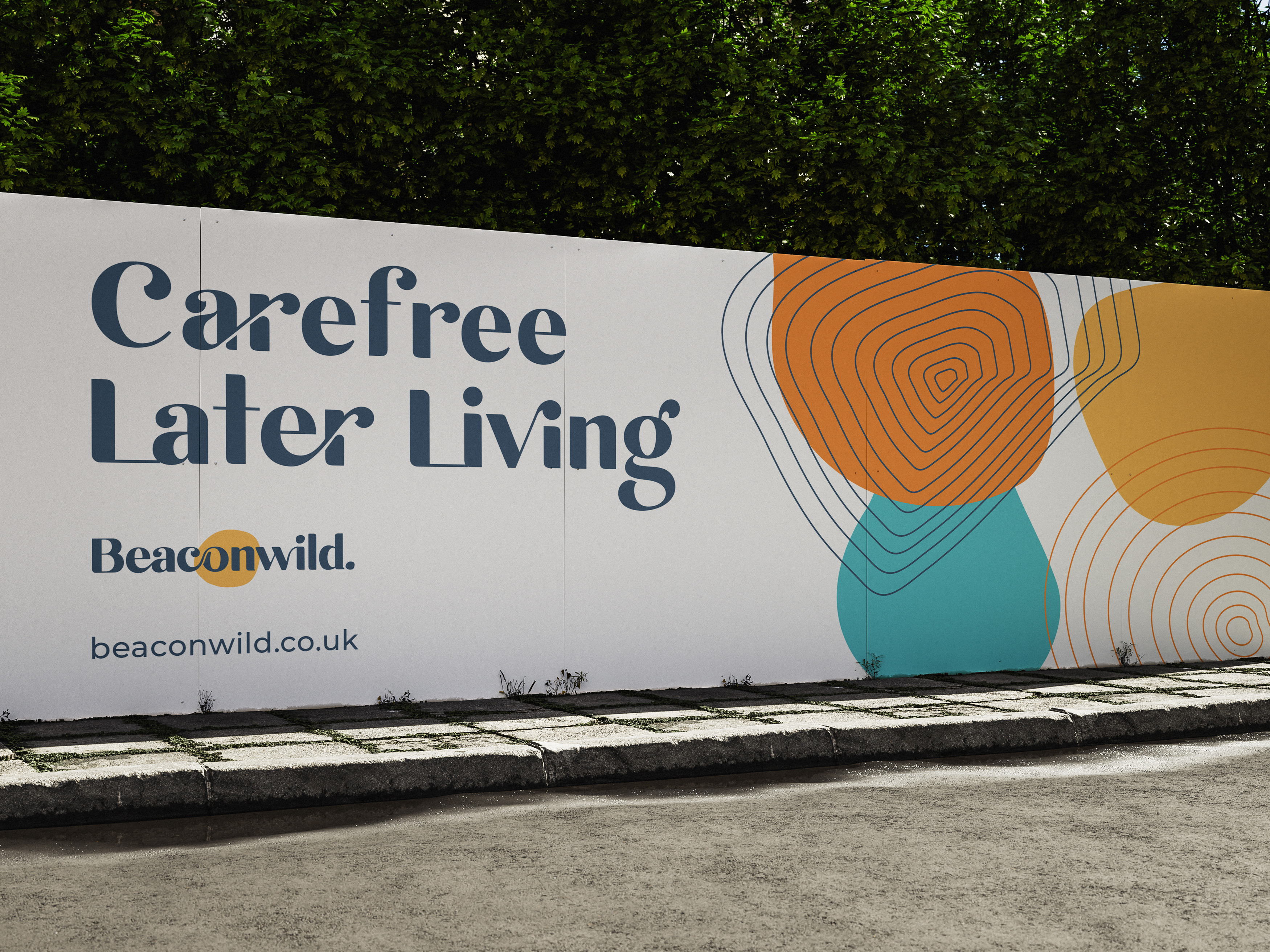
Beaconwild Charity Rebrand - A new identity for a bold new chapter
Brand strategy, naming & visual identity for Beaconwild (formerly Abbeyfield South Downs)
"Vardeep brings the creativity, process, and talent to more than hold her own against any agency. She has a real ability to translate complex organisational ideas into clear, compelling brand identities and she does it collaboratively, through a methodical process that brings all your stakeholders with you. She's an exceptional listener who genuinely understood our organisation, and handled conflicting input with skill and sensitivity. The research underpinning the work was excellent. The end result is a brand we're proud of, one that is distinctive, practical, and built on real strategic clarity. We'd recommend Vardeep to any organisation looking for a branding partner who brings strategy, creativity, and craft in equal measure."
— Jo Sorenson & Nolan Taylor, Beaconwild

The Problem
Beaconwild, then Abbeyfield South Downs, is a not-for-profit providing quality housing for older people. Not a care home, but a genuine middle ground: home-cooked meals, friendly faces, independence with support nearby, all at rents someone on a modest pension can afford. For decades they'd done this as part of the wider Abbeyfield movement, rooted in the philosophy of its founder, Richard Carr-Gomm.
Now they were leaving Abbeyfield to stand on their own, which meant giving up the one name people recognised. That left them with a real set of challenges for an organisation stepping into a new chapter:
- They were losing the name they'd always been known by. Around 90% of enquiries came through the Abbeyfield website. Leaving meant starting a new name from scratch, with everything that rides on being found.
- What they do is genuinely hard to categorise. They sit between a care home and an ordinary rental, a space most people don't know exists. Being unique also means being harder to find and harder to explain.
- Heritage to honour, and a whole board to bring along. With trustees, managers and long-held values all tied up in the old identity, the change carried real weight and a lot of attachment.
What they needed was a name and identity that said clearly who they are and who they're for, so the right older people, and their families, could find them, understand them, and trust them enough to make somewhere their home.
The Solution
This mattered too much to rush, and there were a lot of voices to bring together. So I built the whole thing on listening first, and grew everything from there.
- In-depth stakeholder interviews: so the brand was rooted in authenticity. I carried out interviews with the general manager, the retired-then-returned CEO, and the marketing lead, drawing out the history, the founder's story, and what the organisation really stands for now.
- A house visit and customer input: so the tenants' own words shaped the brand. Visiting a house and hearing directly from tenants and managers grounded the messaging in real lives, not marketing language.
- An in-person board workshop: so all voices were heard. Getting everyone in one room brought up honest views, settled the naming debate, and built the buy-in that carries a rebrand like this.
- A strategic brand foundation: so they knew exactly who they are away from Abbeyfield. Positioning, values, personality, mission and manifesto, honouring the Carr-Gomm heritage while defining an independent future built on independence, community and dignity.
- Naming - Beaconwild: so the organisation had a name free of the geographic and brand confusion the old one caused, and room to grow beyond one region. Arrived at only after the strategy was clear, so the name genuinely fits who they are.
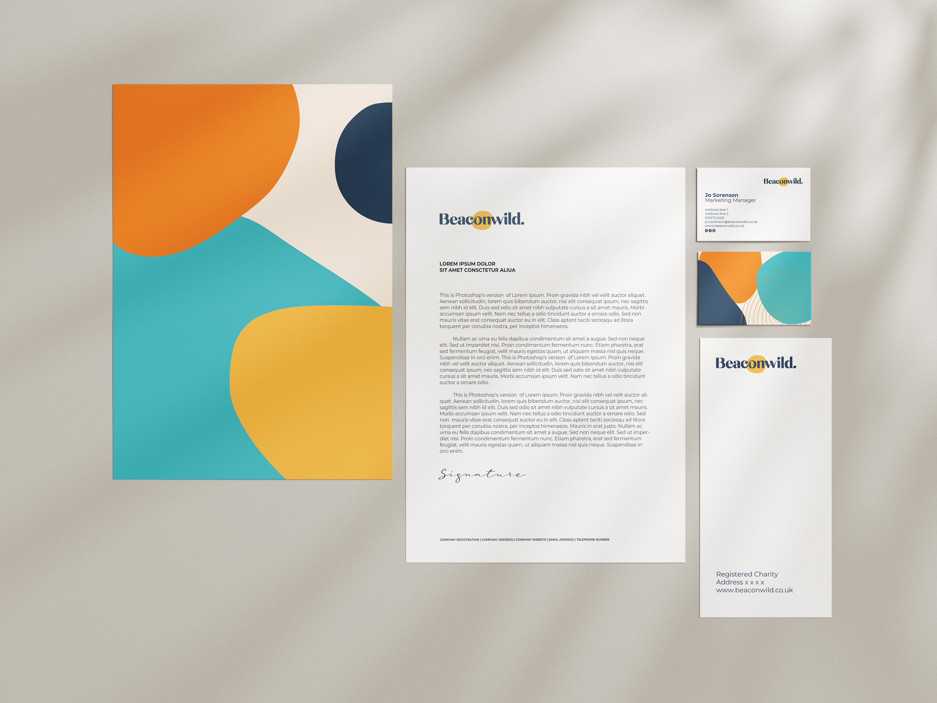
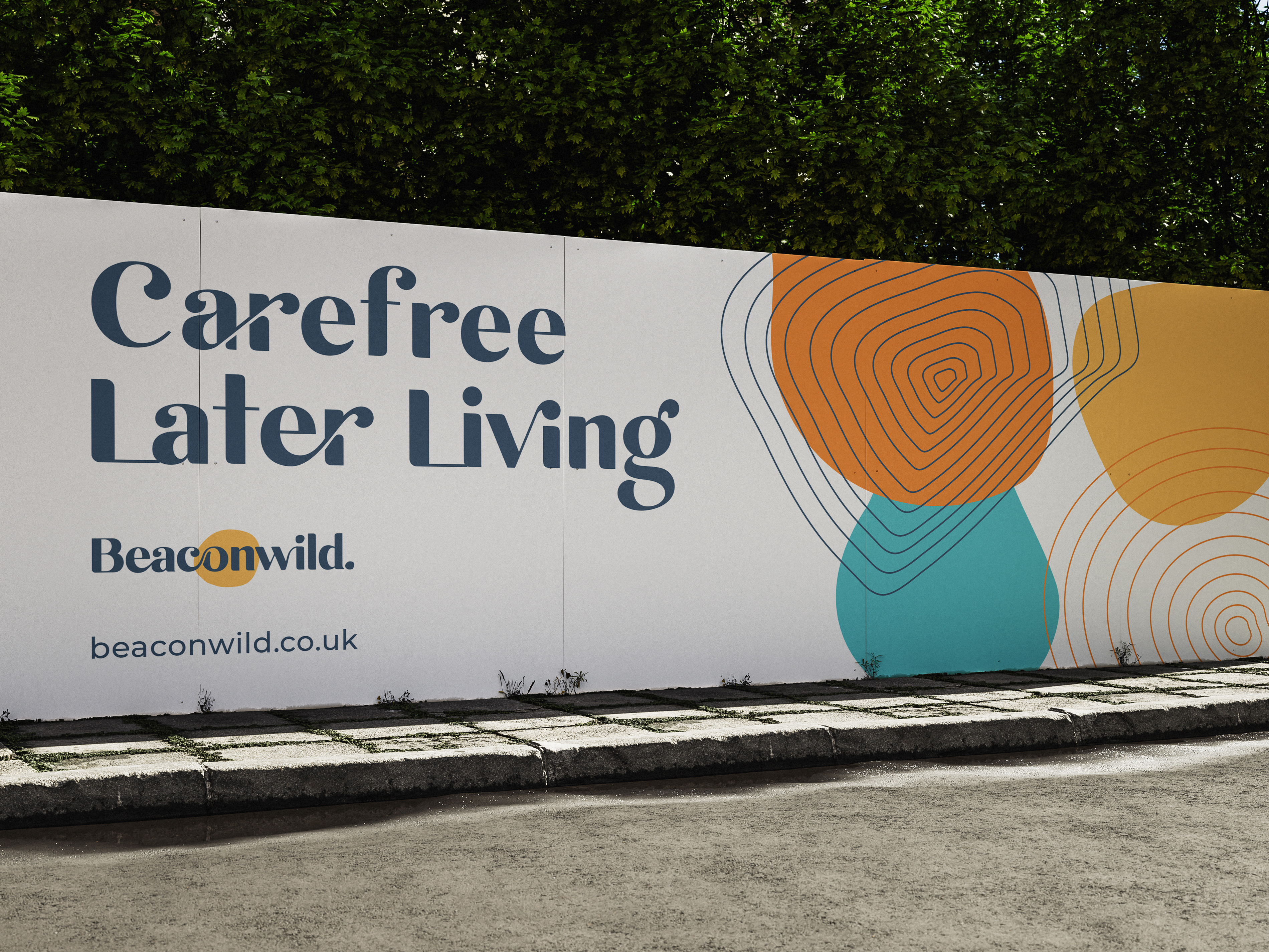
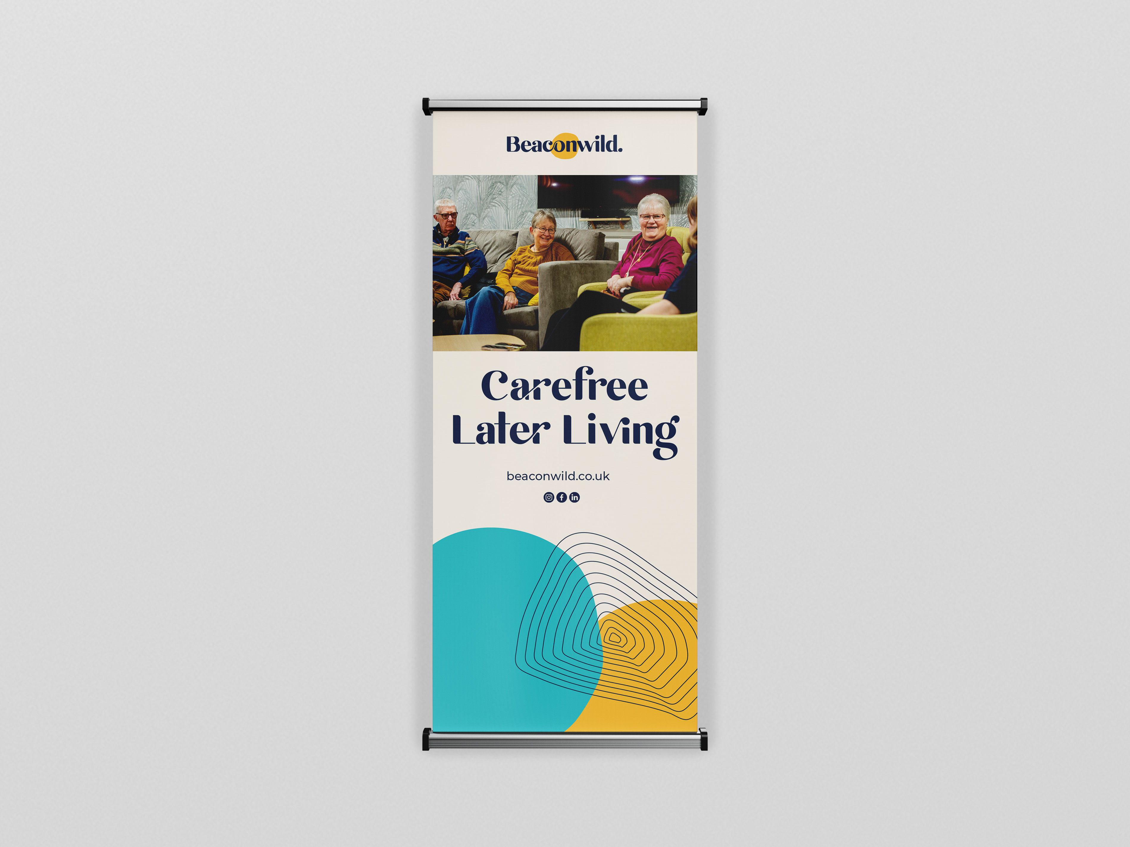
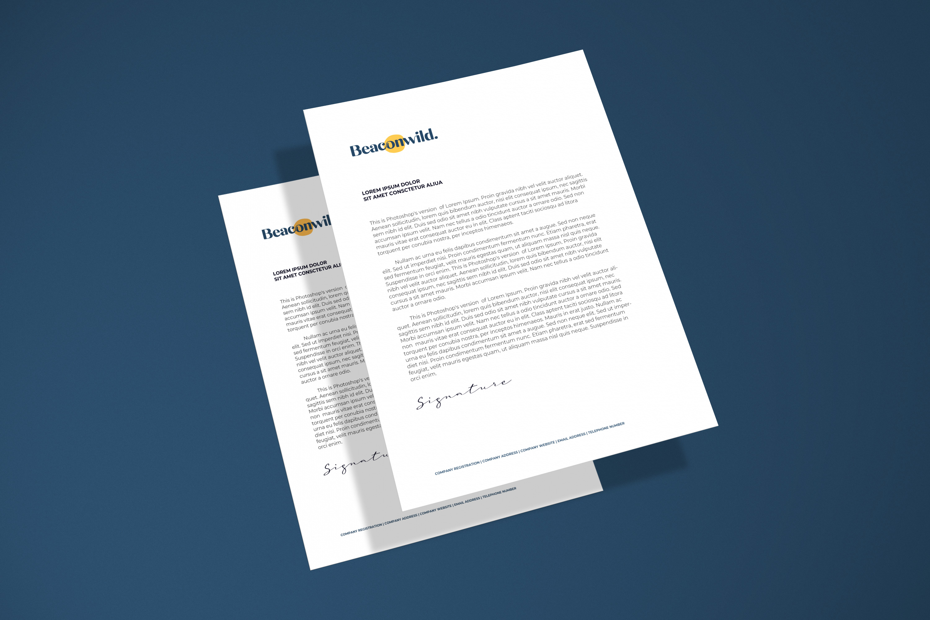
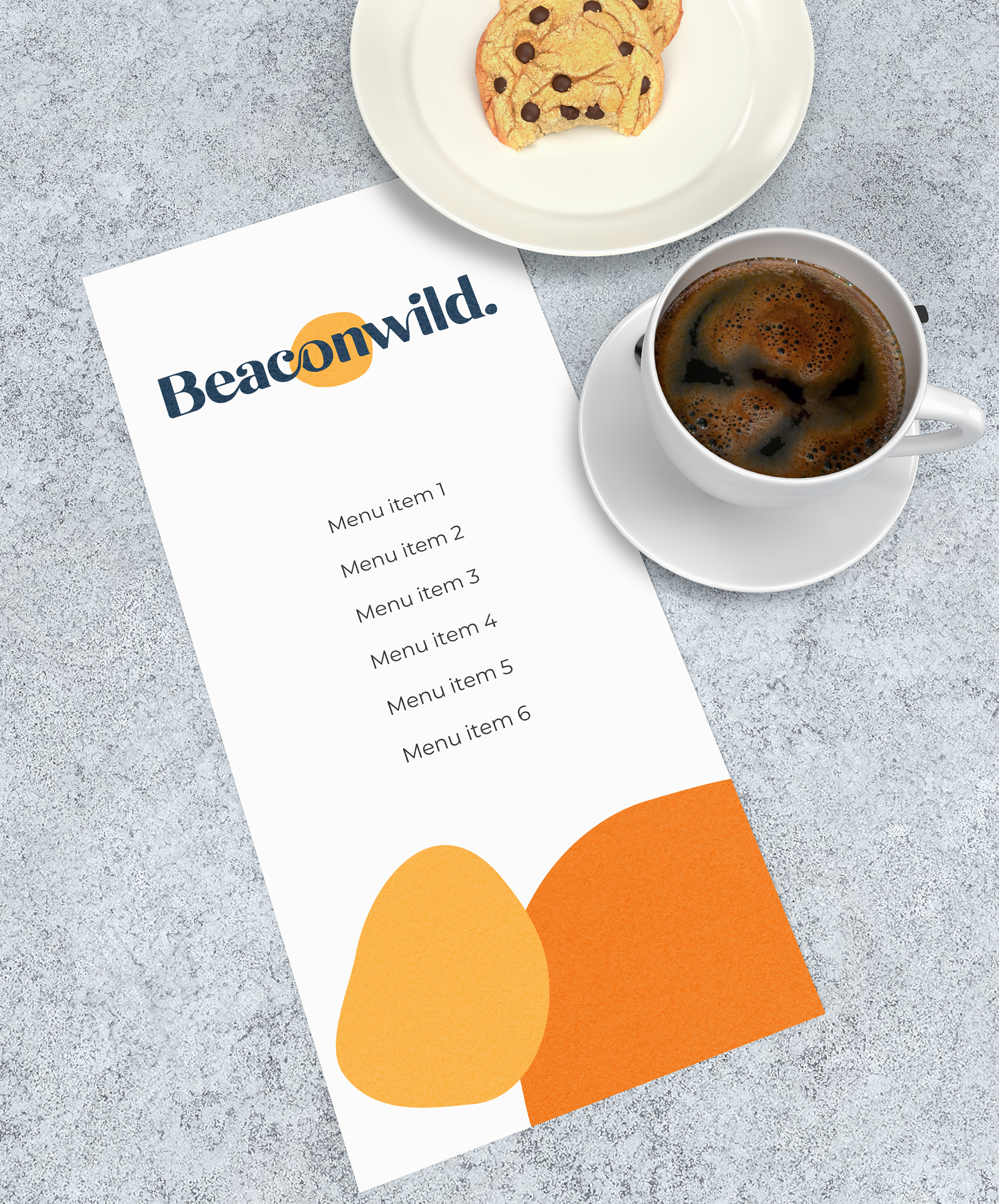
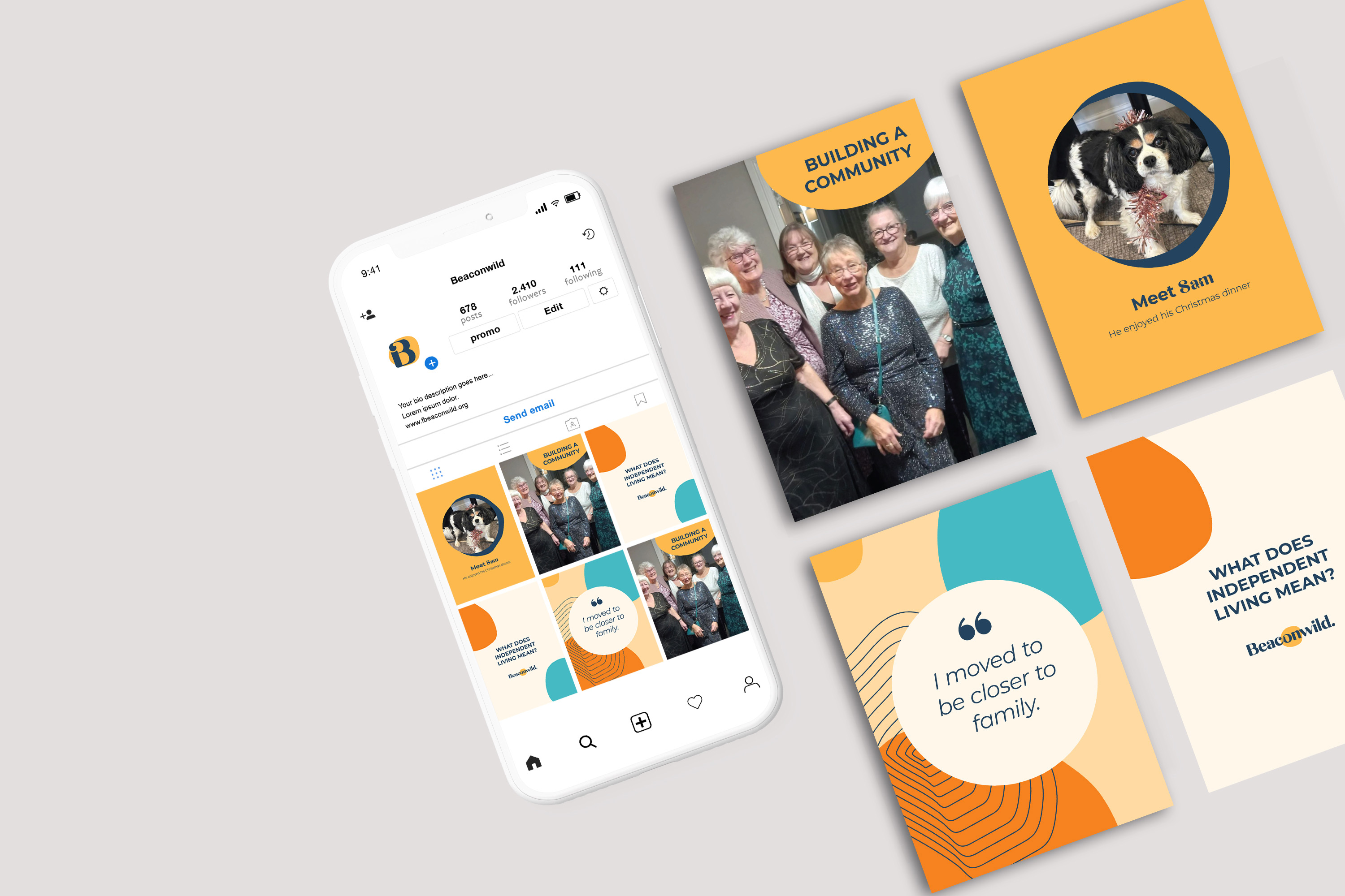
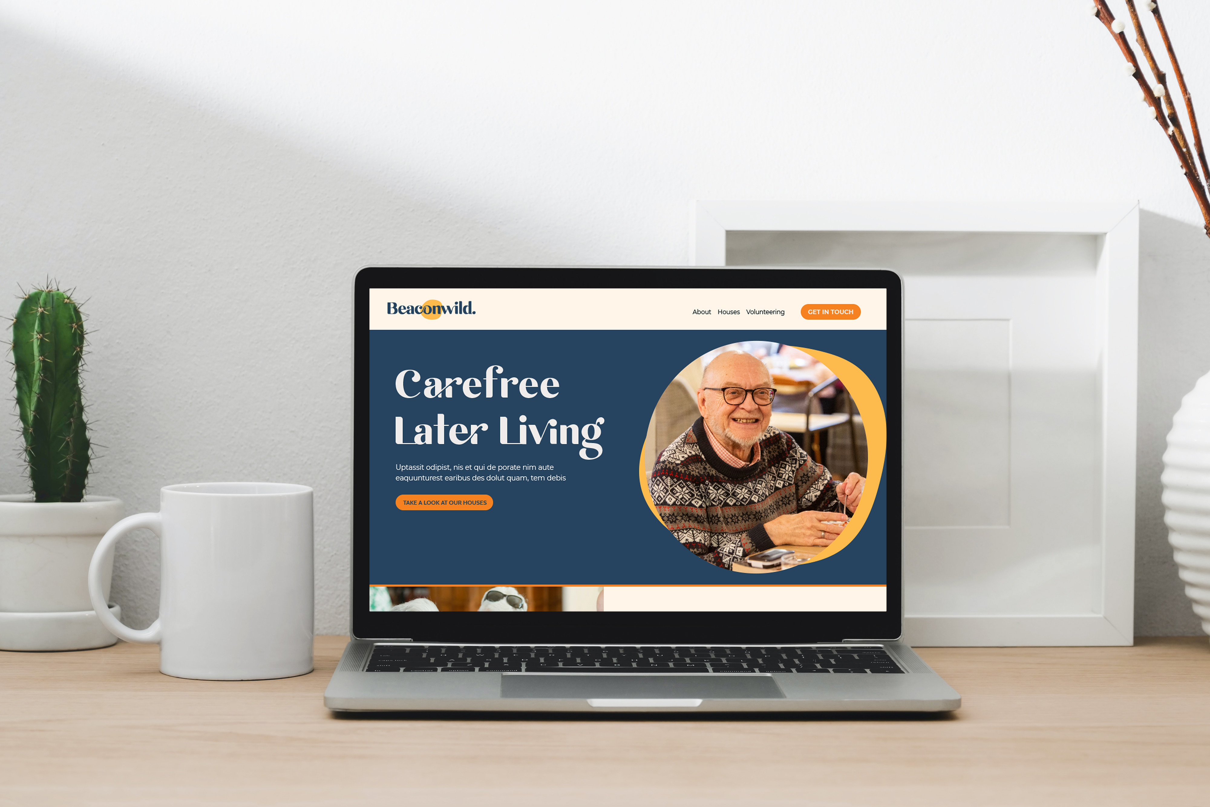
- A distinctive visual identity and signage: so a warm, human brand replaced an institutional, care-home feel, and worked consistently across houses, print and their new website.
The Outcome
Beaconwild came away with a brand built on real strategic clarity that was distinctive, practical, and genuinely theirs.
- A new name, Beaconwild, that stands on its own and isn't tied to one location
- A clear position in that middle ground between a care home and a rental
- A warm, human identity that finally looks nothing like an institution
- Signage and assets ready to roll out across houses and the new website
- A brand foundation, manifesto and messaging the whole team can use with confidence
- A board brought along together, proud of where they've landed


My reflections
I loved this project. It had everything I care about: a genuinely good organisation doing important work, a complex story to untangle, and a room full of people who all needed to feel heard before we could move forward.
The heart of it was belonging. Beaconwild exists so older people never have to choose between their independence and their connection to others, so no one has to feel the weight of an empty house. My job was to give that a name, a voice and an identity clear enough that the people who need it can find it and trust it. That's exactly the kind of work I'm here to do.
Explore more case studies

Let's elevate your brand today
Get in touch
