
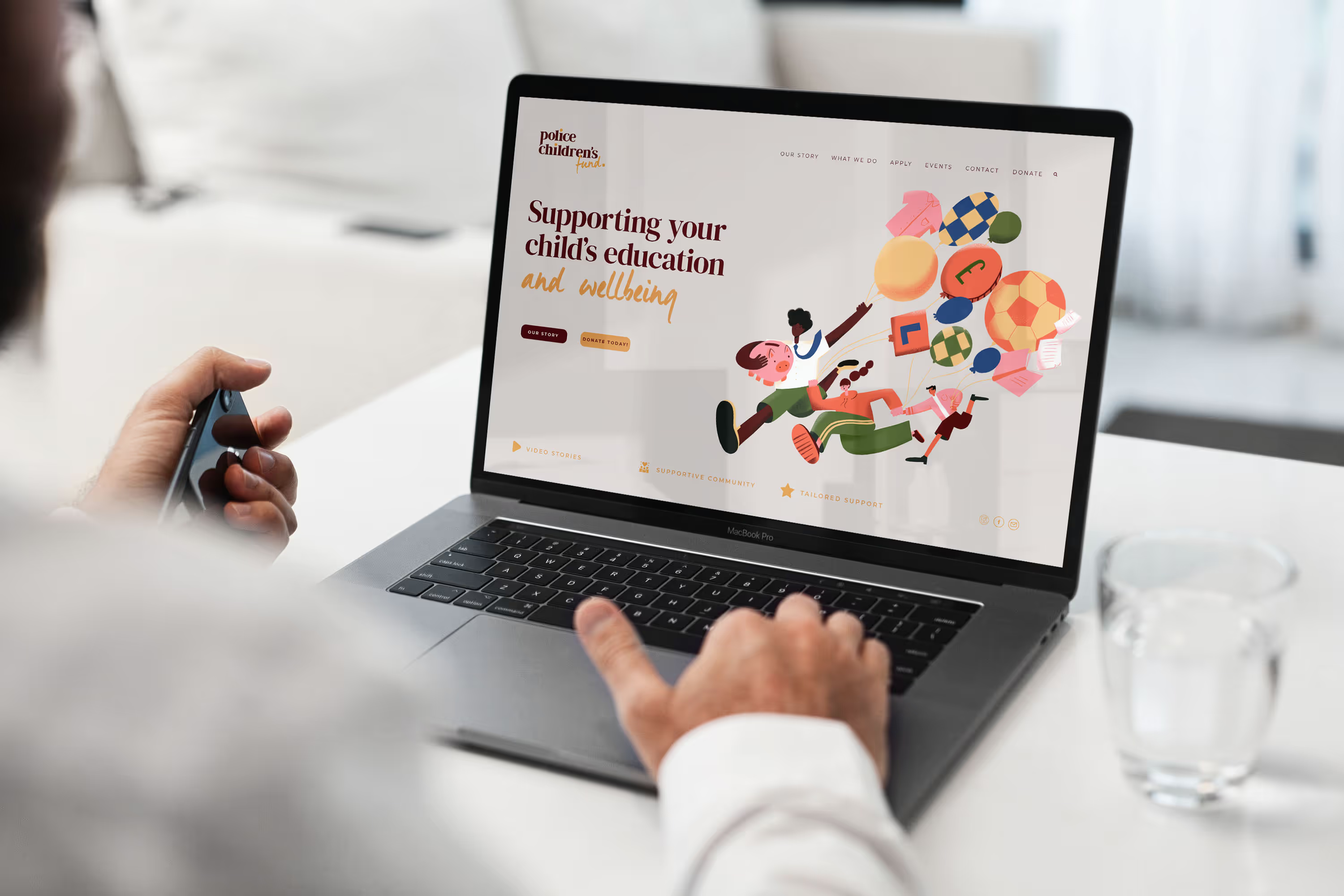
Charity Rebrand: How Police Children’s Fund Transformed Their Identity with Purpose-Led Branding
A complete brand refresh for police children's fund
"We are thrilled with how Vardeep brought our brand to life. Despite our charity's complexity, she quickly grasped our mission and effectively captured it in our branding. Our old name, The Gurney Fund, didn't say what we do, so we needed one that did, and together we found it. Vardeep helped us do it properly, so we won't have to do it again for a long time. From our first meeting, we felt at ease with her. She's not only great to work with but also truly cares about her clients."
— Sherral, Police Children's Fund

The Problem
The Police Children's Fund, established in 1890 as The Gurney Fund, named after its founder Catherine Gurney, supports the children of police officers through some of the hardest moments a family can face. For more than 130 years they've been there for families when it matters most.
When Sherral, who has given 14 years to the charity, set out to build a new website, it became clear the brand wasn't ready to growwith them. The old identity was holding them back in three ways I see often with purpose-led organisations:
- Their name didn't say what they do. "The Gurney Fund" gave no clue they were a children's charity, or who they help. As Sherral put it, it obviously doesn't say what it does, so they needed a name that did.
- Their brand made them invisible. Blue and police-themed like almost every other police charity, the identity gave them no way to stand out.
- Their own audience didn't know them. Their supporters are serving police officers, drawn from 22 subscribing forces and when the charity checked, 19 of those 22 forces weren't familiar with the fund or what it did.
This wasn't a design problem. It was a recognition problem. What they needed was to be seen clearly by the very people they rely on, and to keep showing up for the families who count on them. If your own community don't know about you, it gets harder to reach them.
"They didn't know what The Gurney Fund was. It doesn't say what it does, so we needed a name that did." — Sherral
The Solution
This was a charity with history and a name tied to its founder. Getting everyone on board mattered as much as the design itself, so we started with the people who knew the charity best.
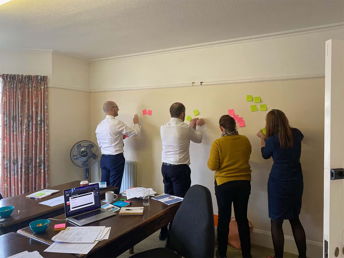
- A full-day, in-person trustee workshop: so the whole team helped to shape the brand. Several trustees are serving officers, and getting them in one room brought up honest views, and brought a cautious team along with the change rather than presenting it to them at the end.
- Intensive brand and audience research: so every decision was backed up. I analysed the existing brand and got under the skin of who they needed to reach, especially the serving officers who didn't yet know they existed.
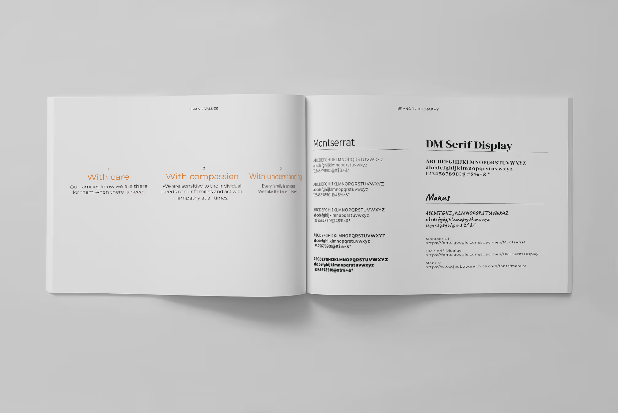
- A strategic brand foundation: purpose, personality and positioning. Communicating the warmth of a charity that supports families through their worst days, and the clarity of a grant-giving organisation doing something concrete and dependable.
- A new name - Police Children's Fund: so no one has to translate who they are or who they help. The name says both, instantly, with no explanation needed.
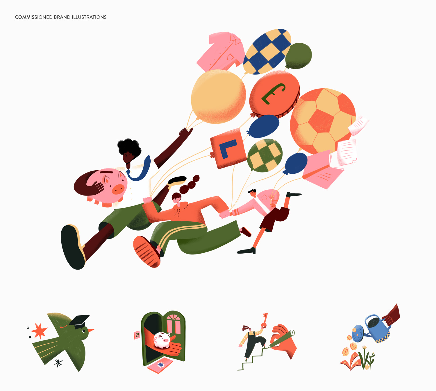
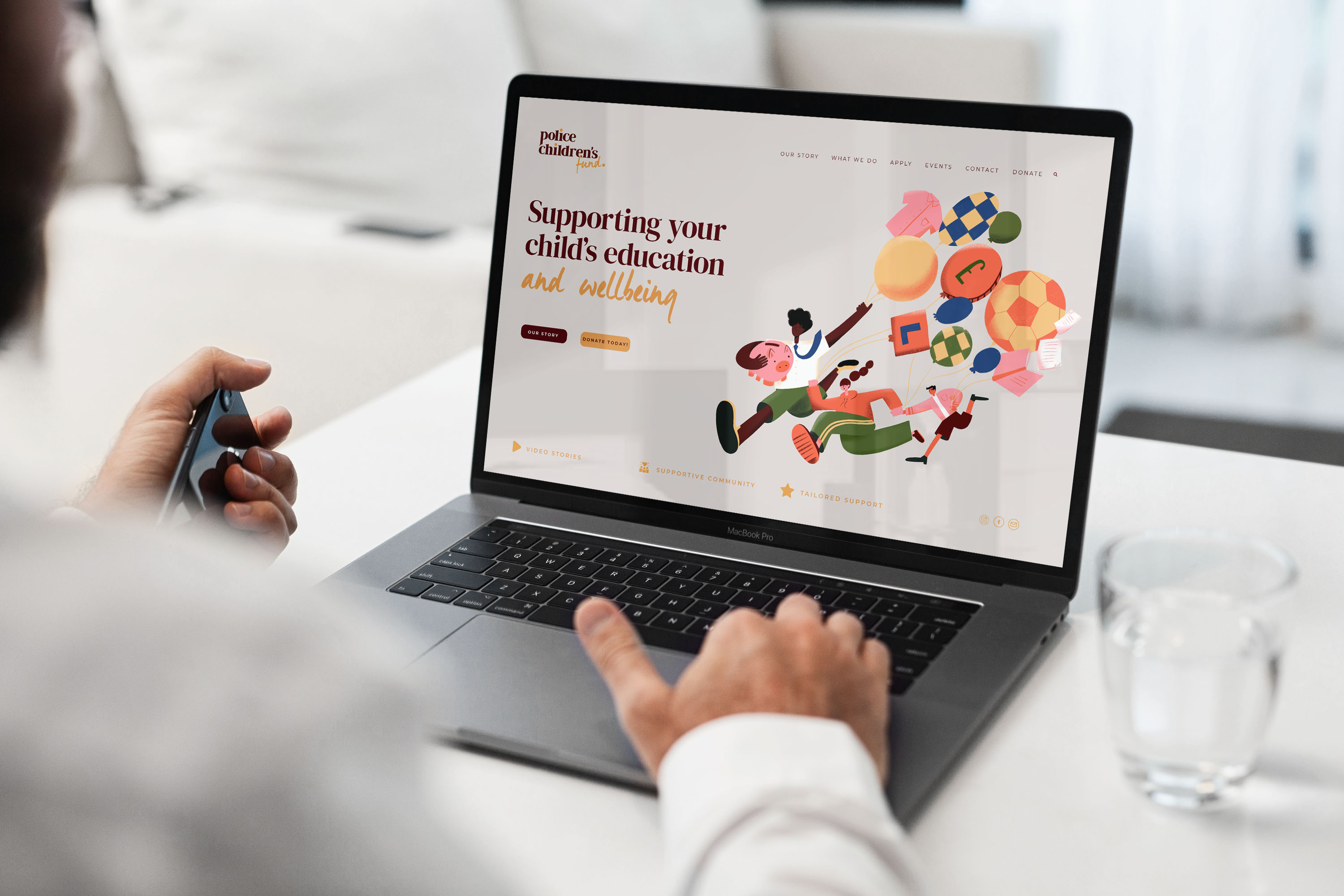
- A warm, distinctive visual identity to include bespoke illustrations: so they finally stood apart from every other police charity. I moved them away from the traditional blue and commissioned, briefed and art-directed a set of illustrations to add real humanity.
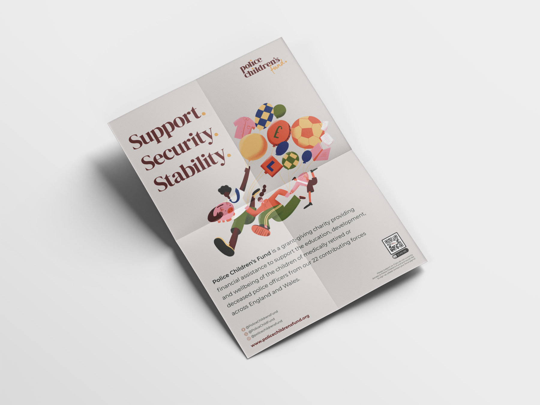
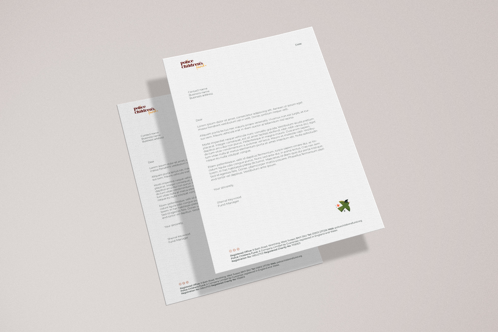
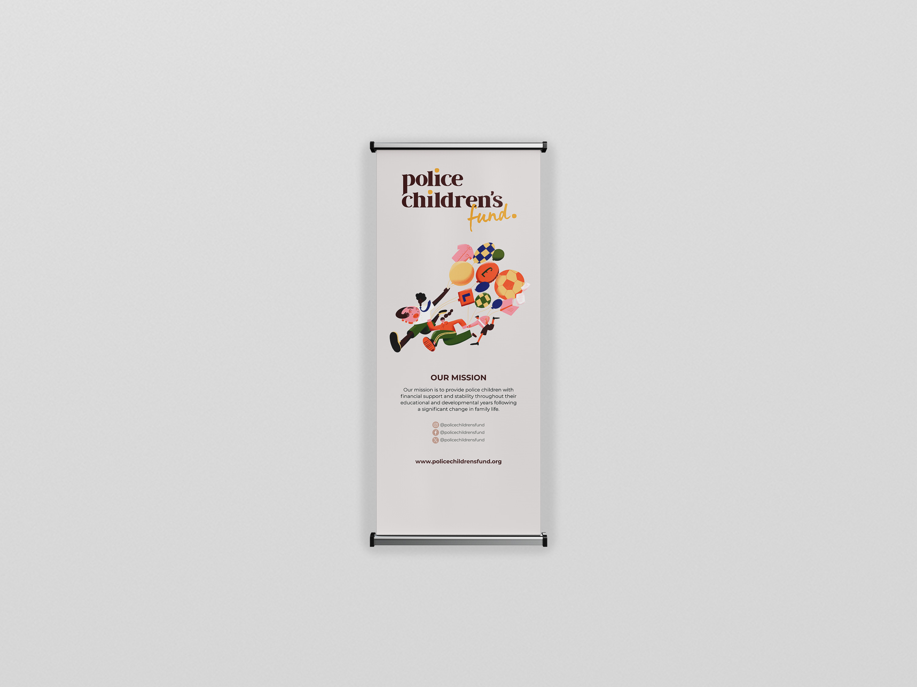
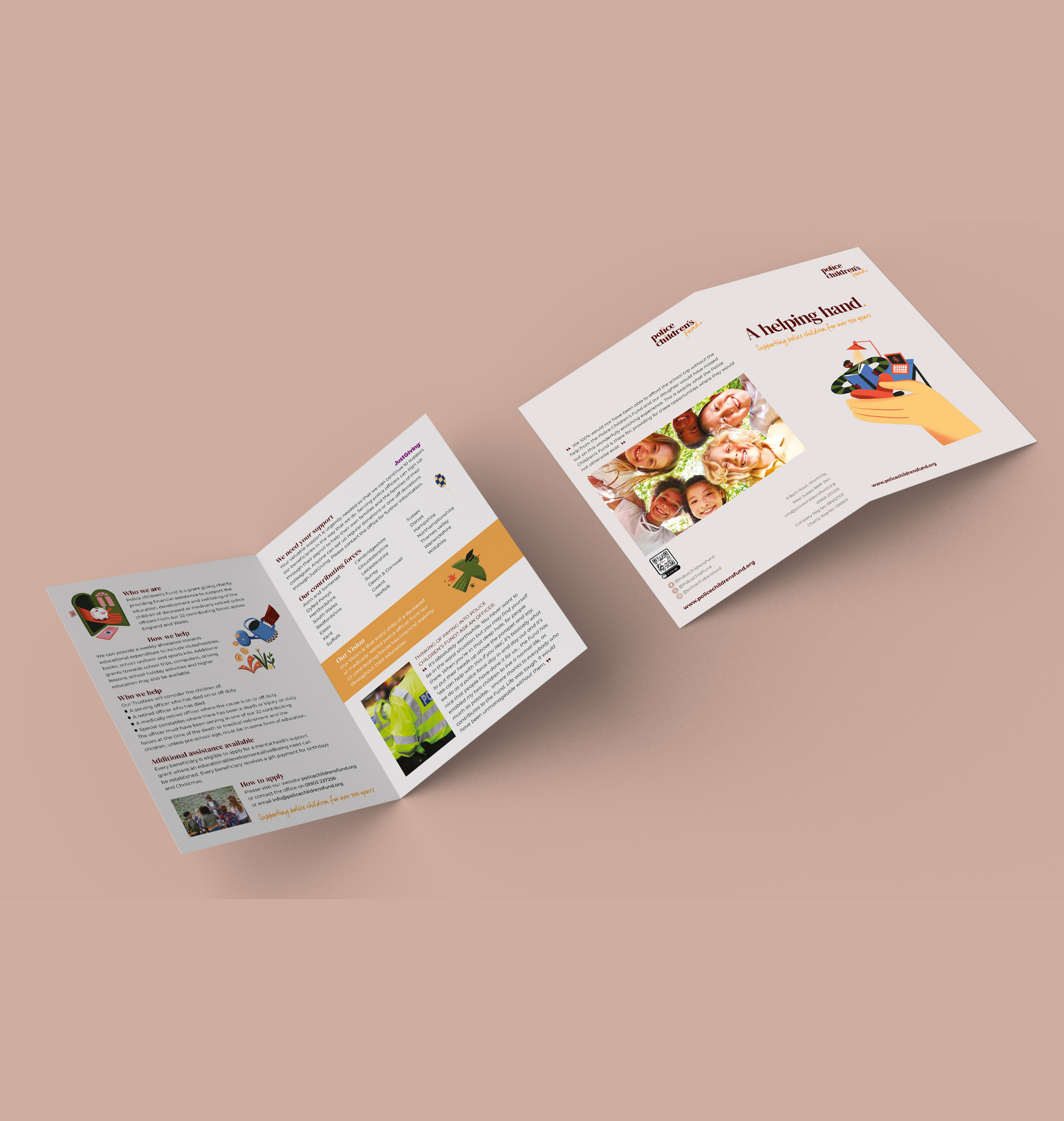
- A full set of marketing assets and brand guidelines: so the team could show up consistently from day one, across a pop-up banner, leaflet, poster, letterhead, social media assets and a complete set of guidelines.
The Outcome
The transformation went far beyond a new look.
- A clear, distinctive name that explains exactly who they are and who they help
- A warm, recognisable identity that stands apart from other police charities
- Bespoke illustrations that bring humanity and warmth to every touchpoint
- A full suite of marketing assets aligned to the new brand
- A more confident, prouder team, genuinely eager to show off their charity
- A brand built to reach the donors and families who need it most
Most tellingly, the change wasn't only external. The team became prouder ambassadors with a renewed sense of purpose, and at last the tools to tell their story to a wider audience. For a charity that had feared being overlooked by the very people it needs most, going from invisible to instantly recognisable is everything.

My Reflections
Working with the Police Children’s Fund team was such a great experience! Taking their brand from a traditional, outdated, police-themed identity, which didn’t really help them stand out and transforming it into something warm, accessible, and supportive that truly reflects their mission was such an interesting and meaningful project to be part of. The new brand is not only instantly recognisable but also perfectly aligned with the charity’s goals, and I’m so proud to have been involved in bringing their vision to life.
Let's elevate your brand today
Get in touch
