Rebranding Creative Minds: A Fresh Identity for an Arts Social Enterprise
A refreshed brand identity for Creative Minds, a national arts social enterprise
I don’t believe in surface-level design. My approach is rooted in clarity, strategy and purpose, getting to the heart of what makes a brand meaningful, and building from there. For Creative Minds, that meant honouring the spirit of their work while shaping a cohesive, professional identity that could grow with them. I led with curiosity, collaboration and care, ensuring every decision, from logo refinement to layout grids, reflected their mission to make art accessible for all.
The Brief
Creative Minds, a national social enterprise with over 10 years of impact, delivers empowering, therapeutic art sessions across the UK in care homes, schools, day centres, and disability services. Their mission is rooted in making art accessible for all, fostering self-expression, confidence, and connection through creativity.
They approached me to develop a new set of brand guidelines. But it was clear from the start that this wasn’t just a visual project, it was a chance to elevate how their powerful work was being communicated across every touchpoint.
Here’s What Happened
While Creative Minds originally asked for brand guidelines, I quickly saw that their existing logo and visual assets weren’t reflecting the professionalism, warmth, or personality of their work.
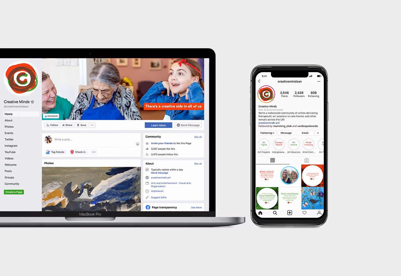
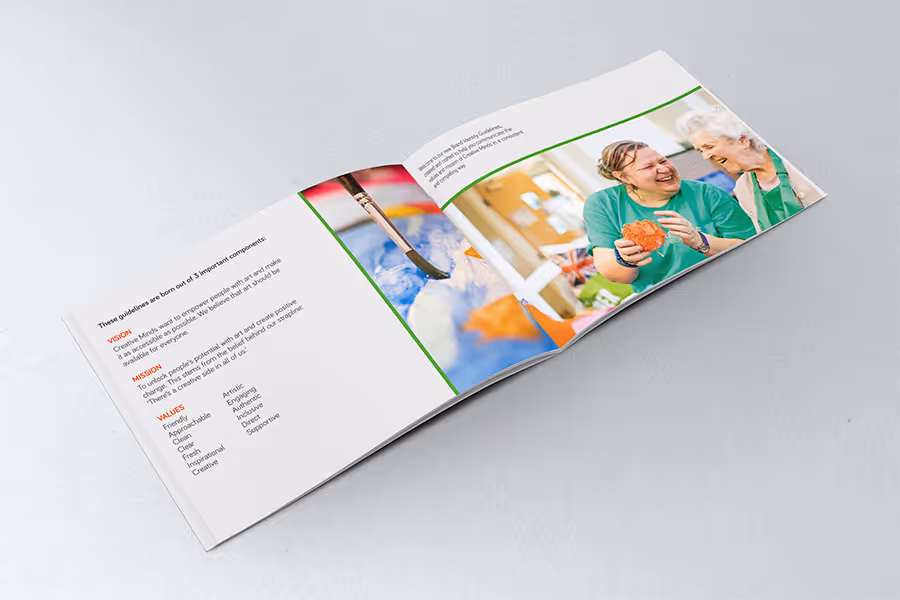
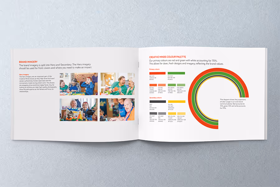
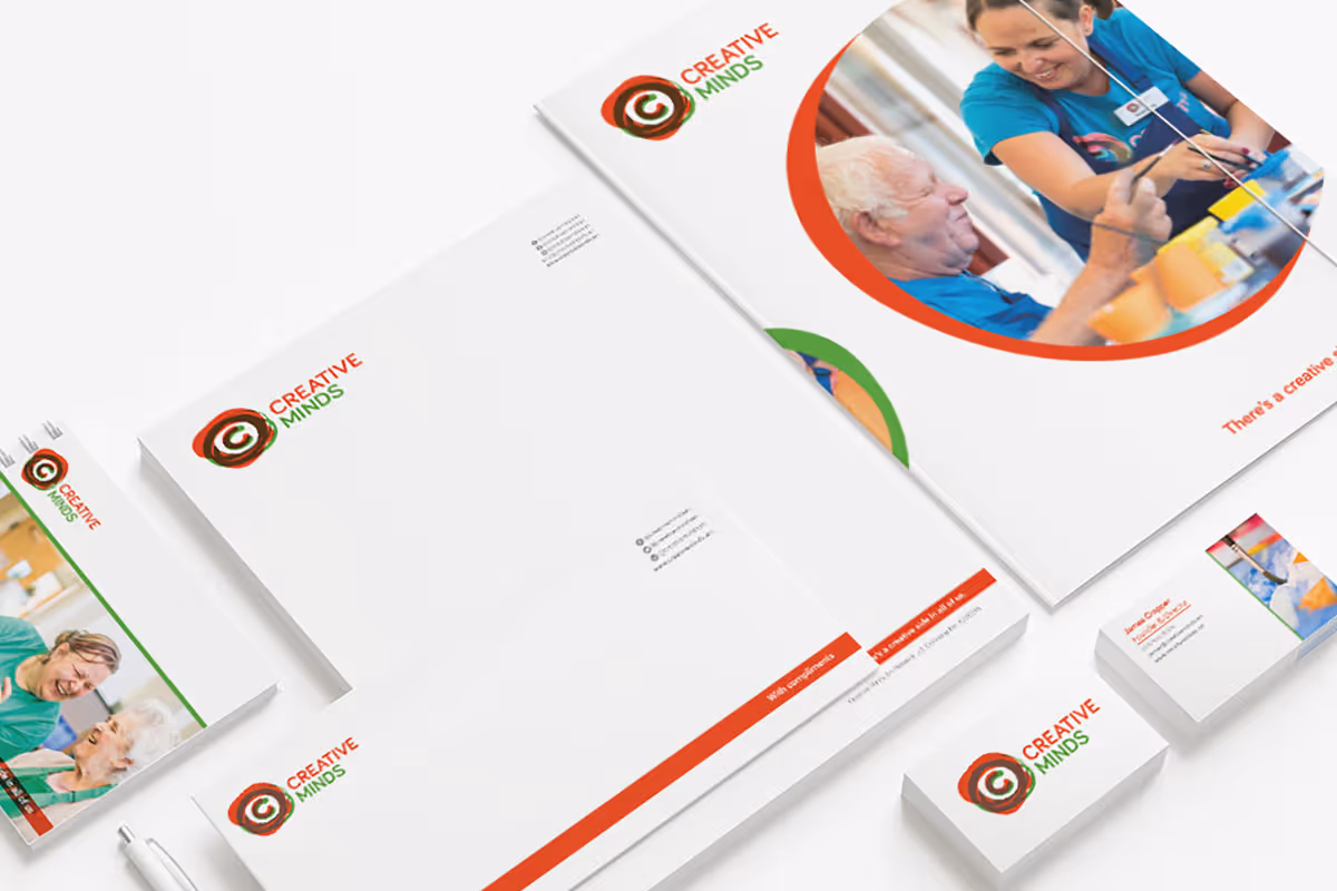
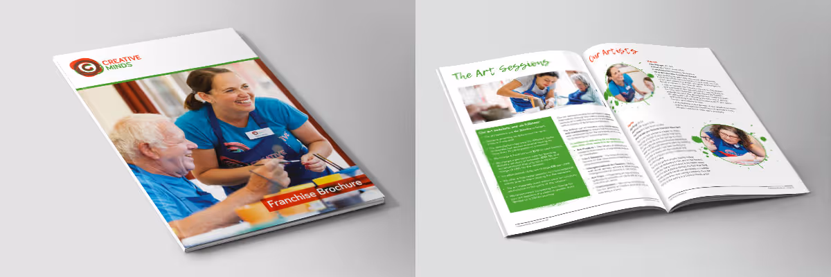
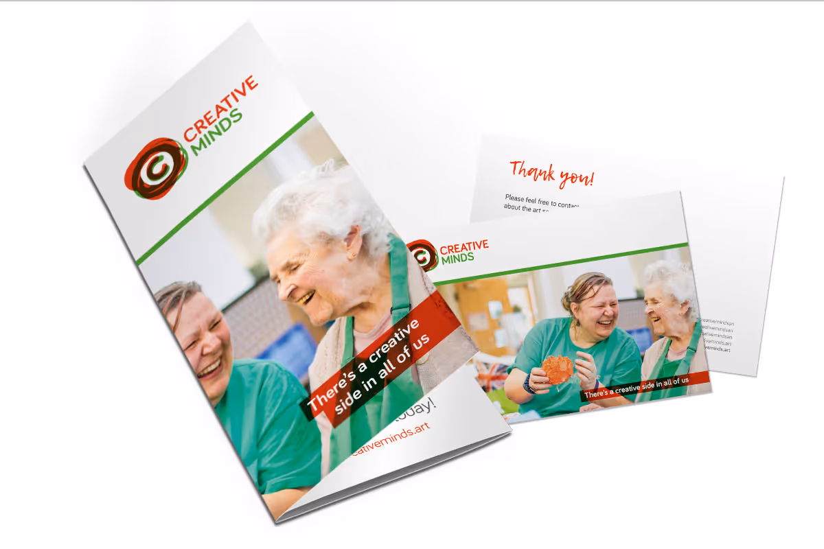
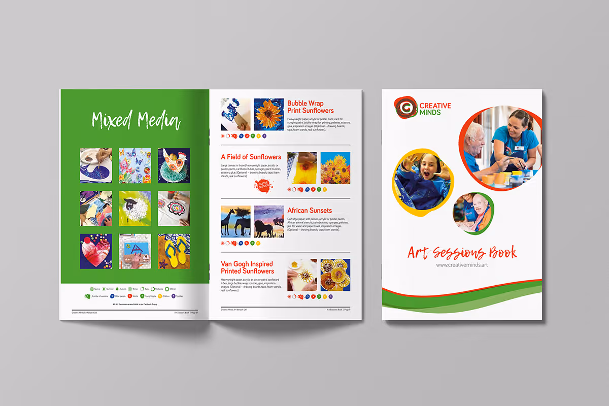
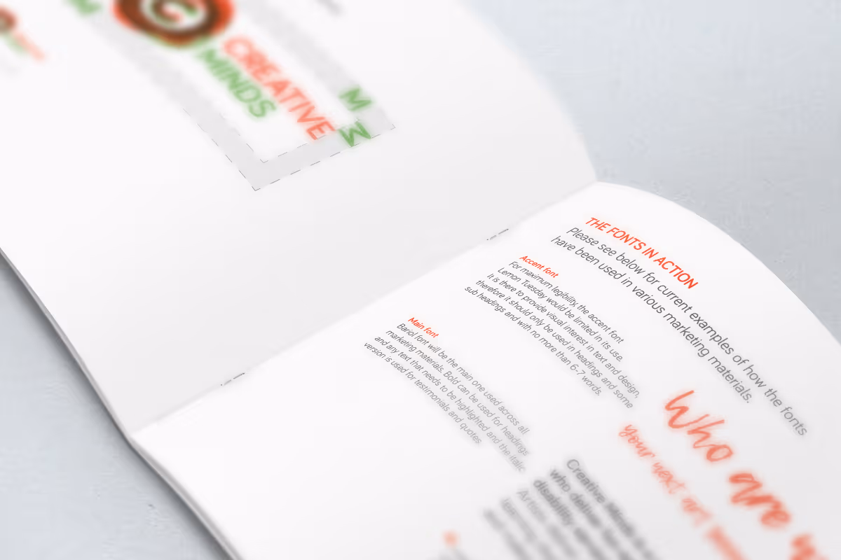
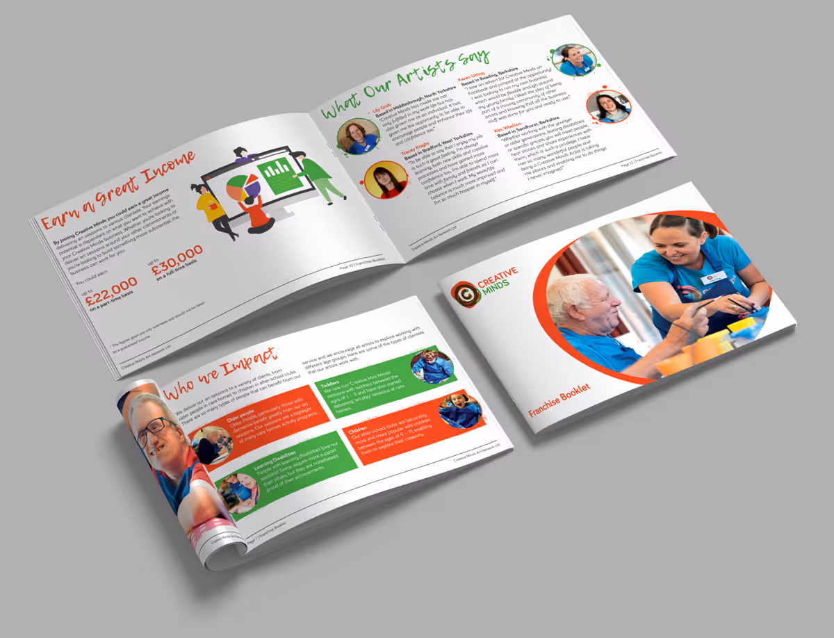
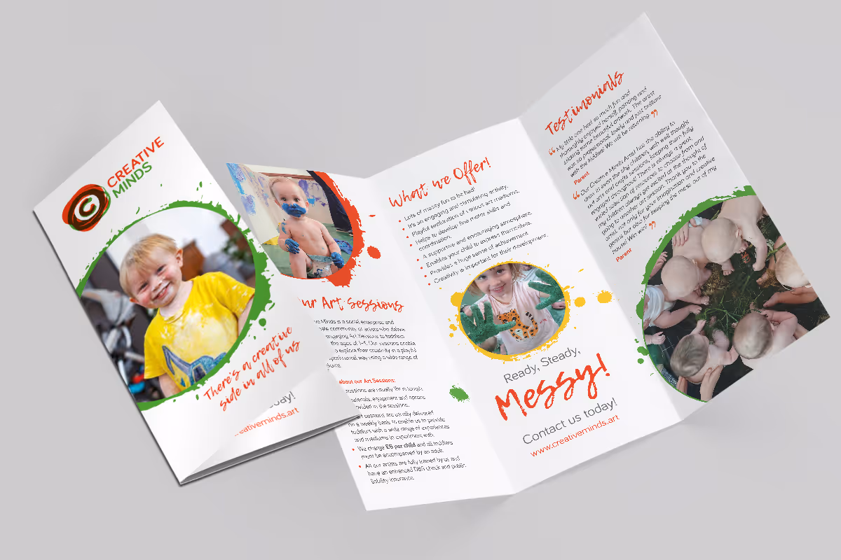
We began by evolving their current logo, modernising it while preserving its original idea From there, I developed a full suite of marketing materials, including leaflets, brochures, social media templates, event collateral, and stationery. I created an extensive and easy-to-use brand guideline document that outlined everything from colour and font usage to layout grids and sub-brand naming conventions.
This wasn’t a generic brand facelift, it was a strategic identity realignment designed to amplify trust, visibility, and clarity. My approach went beyond graphic design, acting as a brand partner to help shape how they show up in the world.


The Result
Creative Minds now has a cohesive, professional brand identity that communicates the scale and integrity of their work.
- Visually: The identity is more modern, versatile, and consistent across all channels, supporting their growing digital presence and new website design.
- Strategically: Their refreshed brand has enabled clearer communication with funders, partners, and the diverse communities they serve. It’s not just a new look, it’s a tool to grow their impact.
- Practically: With a comprehensive suite of branded materials and templates, the team can now implement consistent visuals without reinventing the wheel each time.
“It has been a pleasure working with Vardeep to realise our brand vision. She’s not just a designer, she’s a brand expert who helped us upgrade every element of how we present ourselves.” – Creative Minds

My Reflections
This project reminded me how meaningful design becomes when it aligns with purpose. Creative Minds weren’t looking for ‘pretty’, they needed clarity, cohesion, and confidence in how they present their impact.
As a brand strategist and designer, my role isn’t just to make things look good, it’s to make sure they mean something and had personality. This rebrand wasn’t about aesthetics; it was about helping a social enterprise be seen and taken seriously for the powerful work they’ve been doing quietly for years.
Explore more case studies


Let's elevate your brand today
Get in touch
