

Wedding Photography Branding: Creating an Authentic, Inclusive Identity for LGBTQ+ Couples
A new brand and identity for a wedding photography business
"I wanted my business to be a safe space for the LGBTQ+ community, not just a checkbox. With Vardeep's support, I refined the business' values and mission, adding depth and clarity. She helped define the essence of my business. Vardeep was lovely, easy to work with, and the process felt truly collaborative. I will be recommending her to others as she offers great value for money and is invested in your business from the very beginning."
— James Lester, Love is Love Studio
The Problem
James Lester is a wedding photographer with an established brand, Mine and Thine. After displaying a Pride flag at wedding fairs, he found more and more same-sex couples coming to him, specifically because they could see themselves reflected in his work. It inspired him to build a whole new business serving the LGBTQ+ community in the North East.
But he was conscious of doing this sensitively:
- The obvious route was the wrong one. Rainbows and stereotypes would have made the brand feel like a tick-box, the very thing he wanted to avoid.
- He wasn't sure who his client really was. He thought he knew, but he hadn't done the deeper audience work, and going down the wrong path could have sunk the business before it started.
- He'd been burned by branding before. A previous experience with separate designers and namers had been prescriptive and off-target, so he wanted one person to lead the whole thing, cohesively.
What James needed was a brand that made LGBTQ+ couples feel it was genuinely for them, not marketed at them, so they'd feel safe, seen and welcome.
The Solution
James wanted one person to lead the whole process, and someone who'd get under the skin of what the business really was. So I did the deep work first, and let the strategy shape everything else.
- Brand foundations, values and mission: so the "safe space" idea became something real and rounded. I helped James flesh out his values and mission with the depth and clarity to define what the business truly stood for.
- Deep audience work: so he built for the right people. This was the part that surprised him most, drilling down into who his client actually was, and steering him away from a route that might not have worked.
- Naming: so the business had a name that fit. James had an early idea he'd drifted from, and adding one word brought it back to life, better than before.
- A collaborative visual identity: so the brand felt like his. I presented concepts, then honed the elements he loved into one cohesive direction, rather than handing over prescriptive options.
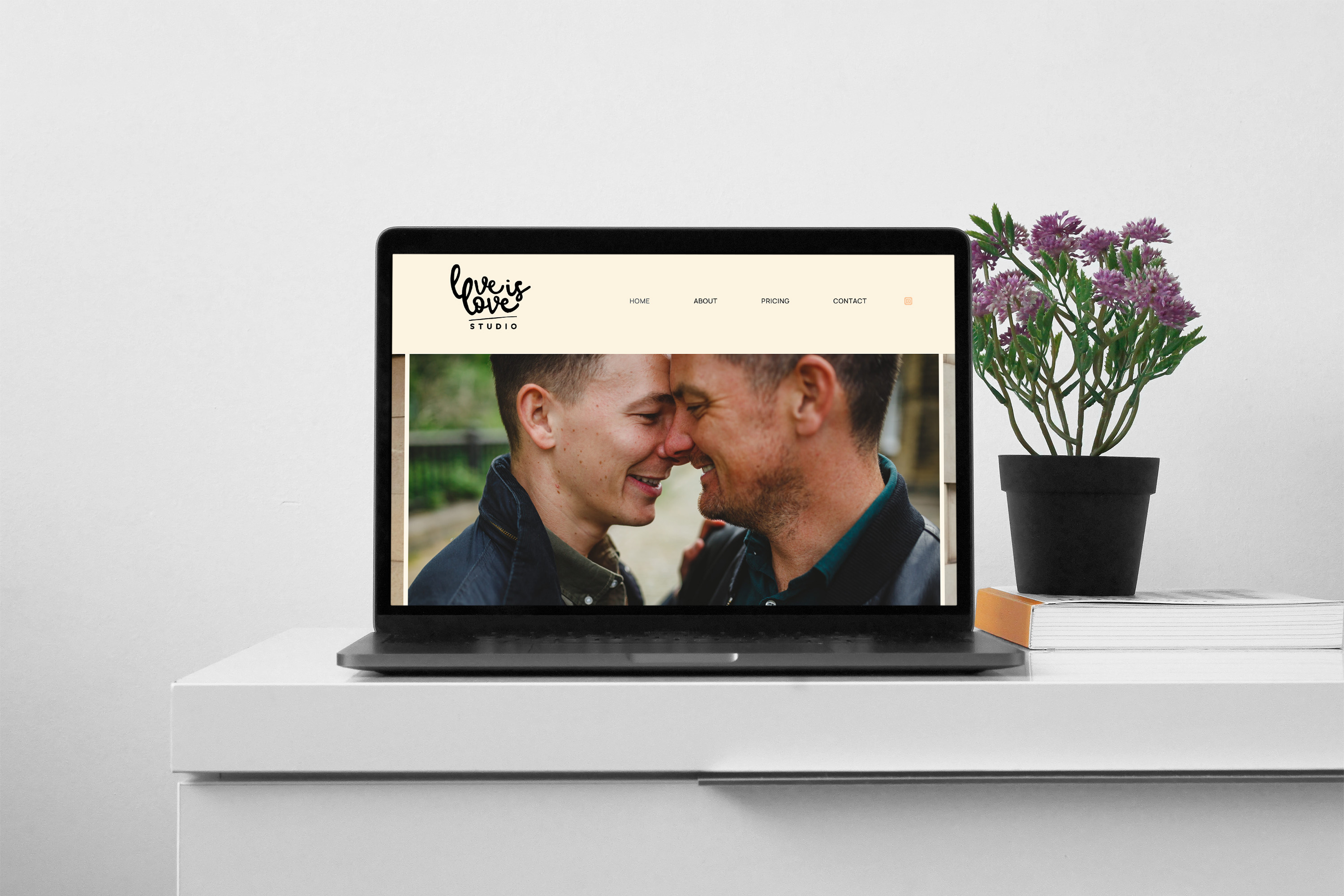
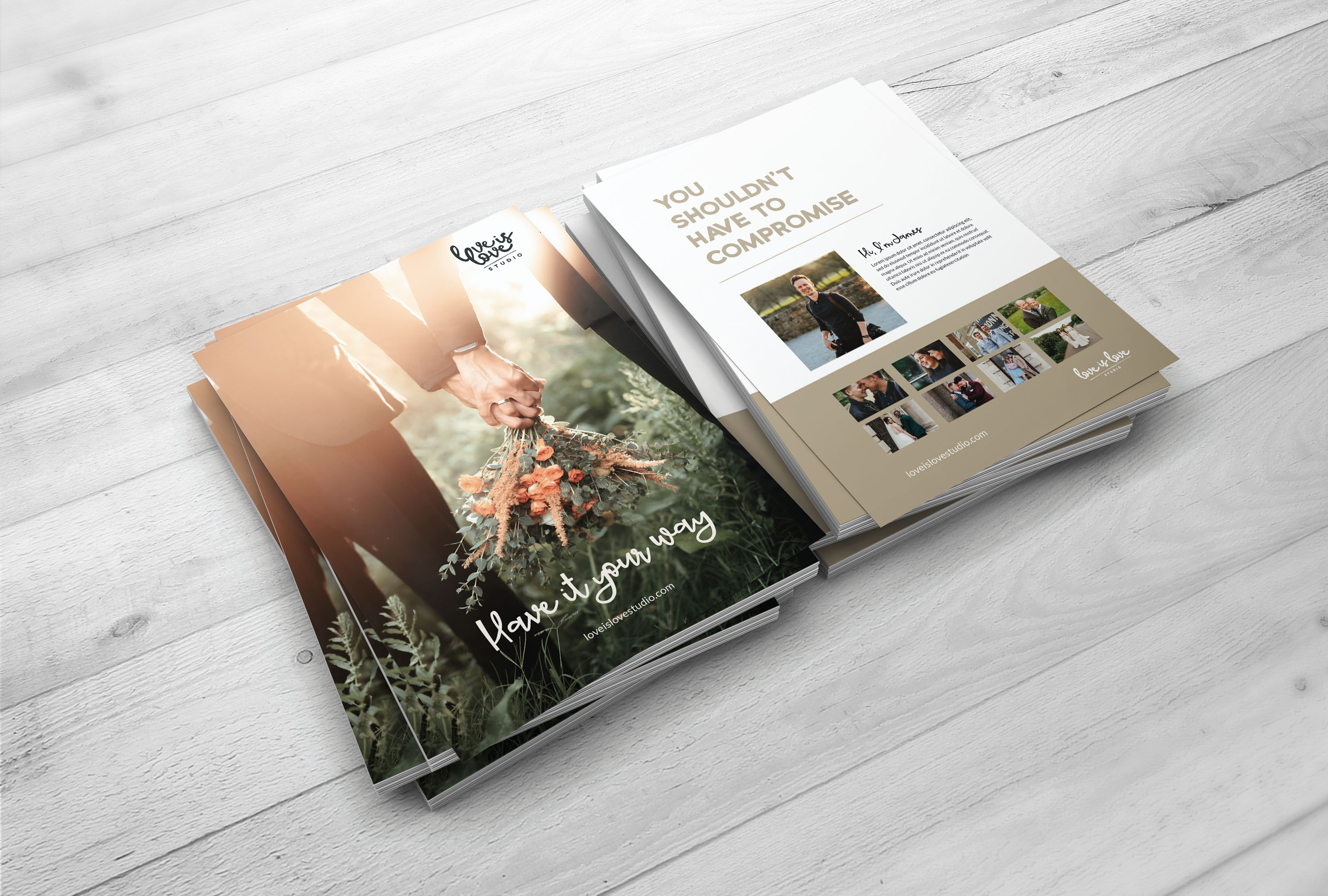
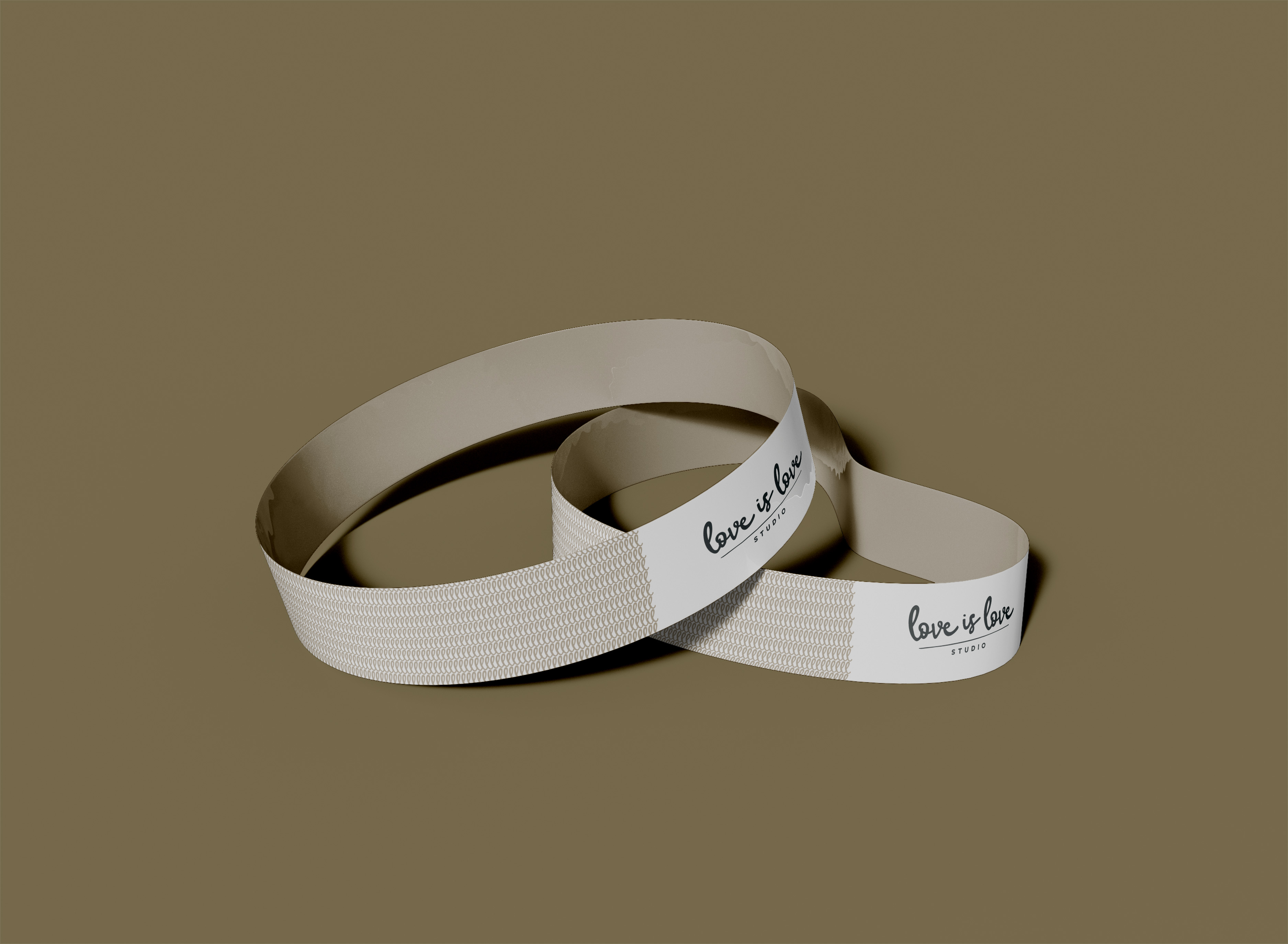
- A photography-led approach: so the work spoke first. We landed on something distinctive, letting his images lead and keeping the branding pared back and never in-your-face, so the couples, not the graphics, are the heart of it.


The Outcome
James came away with a brand built on real substance, and the confidence that it would work.
- A brand that makes the LGBTQ+ community feel it genuinely belongs to them
- Clear, rounded values and a mission with real depth behind them
- A sharp, accurate picture of who his ideal client actually is
- A name that captures exactly what the business is about
- A pared-back, photography-led identity that puts couples first
- Validation from his own past clients, who told him this is what the community needs
When James showed the new direction to previous same-sex couples he'd photographed, the response was clear: this is good, this is what the community needs. The brand was reaffirmed by the very people it's built for, before it even launched.

My Reflections
It's tempting to assume you already know everything about your clients. But it's worth getting realy clear on who you're for as this can change everything that follows.
With James, the real breakthrough wasn't a logo. It was the clarity: who this business is for, what it stands for, and the decision to let his beautiful photography lead rather than dressing it up in something loud. For a brand whose whole purpose is to make people feel they belong, that restraint is exactly right.
It was a joy to help James build something meaningful for the community he serves.
Let's elevate your brand today
Get in touch
